
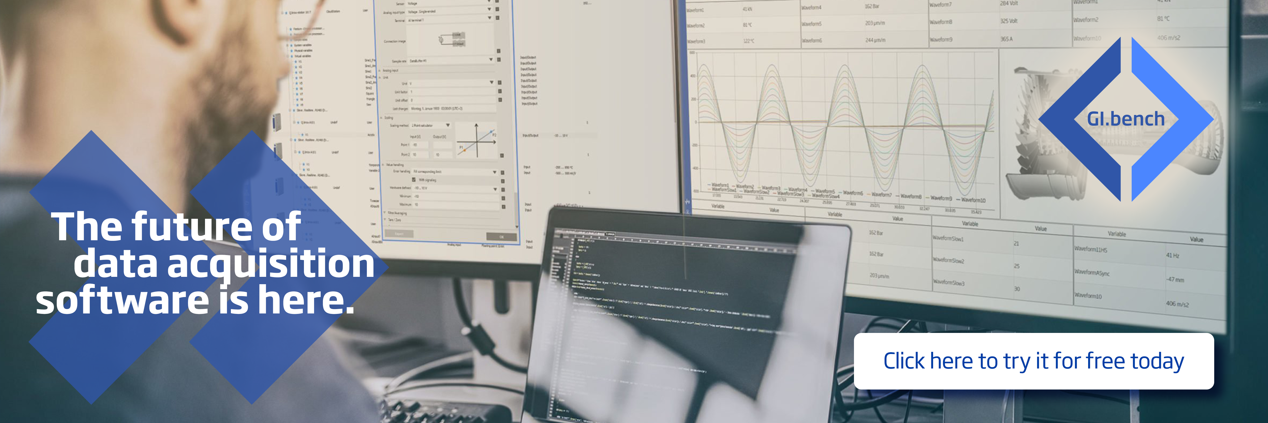
Dashboards are visual translations of data. Modern data dashboards allow engineers to monitor, analyze and react to any measurement data in real-time, regardless of the data volume, transforming data into insight.
And now you can create your data dashboards with GI.bench! Follow these three simple steps to get the most from your GI.bench dashboard.
Step 1: Create a Custom Dashboard with Drag & Drop Widgets
Before creating a dashboard, you need to create or open a GI.bench project with a connected Q.controller. Go to the dashboard under the Data Acquisition tab and select the hamburger button in the top left corner to open the dashboard designer.
Now you can start creating your dashboard and organize it any way that you prefer: drag & drop charts and graphic elements to the canvas. For your convenience, snap to object precisely arranges the charts or graphic elements by aligning them to existing elements on your canvas. Once you have created the layout, you can add the measurement variables to your dashboard by drag & dropping them to the predestined element.
Tip: To make the data in your dashboard more tangible, add a Dynamic Image widget and pick an image from the media library. When placing the image on your dashboard’s background layer, you can overlay your image with widgets like LEDs, gages, or numerical displays in the foreground.
Step 2: Fine-Tune Your Dashboard for Fast Data Analysis
Dashboards should present data in a quick, easy-to-scan format with the most relevant information understandable at a glance. In the GI.bench dashboard, charts and graphic elements are individually configurable to make an effective dashboard display.
In a chart, click the gear icon in the upper right-hand corner to open the Settings menu. Here you can configure the chart axes, colors, and zoom behavior. You can select two types of cursors; the tooltip will show the live value of the data set when you hover over them, and a marker adds two vertical sliders to compare the difference between two data sets in the chart. In graphical elements like LED, gage, or bar chart, you can configure color ranges. Color ranges allow you to set up predefined colors for individual ranges of measurement values as an additional visual cue for the user.
New feature: GI.bench v1.10.0 introduces chart linking, an easy way to visualize the relationship between measurement data spread across different charts in your dashboard. With the chart link feature, you can synchronize actions for multiple charts in your dashboard. You can group charts to zoom, pan, or use the tooltips and markers across multiple graphs at the same time to make it easier for you to get actionable insights into your measurement data.
When you are done editing your dashboard, click on the cross button in the top left corner to leave the dashboard designer mode. GI.bench will automatically save your dashboard as part of the project. You are all set to go!
Step 3: Share Your Dashboard Online
With our online dashboard functionality, you don’t have to be near your data acquisition system to monitor your measurement data. With the built-in web server, you can easily share your GI.bench dashboard with a team of engineers or even your customer.
Enter the computer’s IP address running the GI.bench software in your preferred web browser and add port number 8090 (e.g., 192.168.178.152:8090).
For online dashboard monitoring with a mobile device, click “Show QR code” in the left pane menu and select the applicable network interface. It doesn’t get more straightforward than this!
More articles
International Trade Fair for Electronics Development and Production
Your path to electronic excellence begins at Productronica India 2023. With Gantner Instruments at your side, you are well-equipped to seize opportunities and conquer challenges in the electronic industry. We look forward to meeting you at Productronica India 2023!
Read more...Business Profitability and Edge computing
Our Gantner Instruments partner in the Philippines, DMS Engineering, organized a successful event on the 25th of November, 2022 at CEBU about using Edge Computing capabilities for Asset Monitoring to maximize business profitability.
Read more...How to get insight into your measurement data with online dashboards in 3 steps
Data empowers engineers across sectors to improve their processes, initiatives, and innovations using the power of insight. The ability to monitor and respond to data from an increasing number of sensors can seem like a minefield. Data dashboards have evolved as one of the essential tools for professional engineers to get a grip on their measurement data.
Read more...Q.series X A192
The Multifunction Module when Flexibility and the Highest Performance Matters Most
Read more...